
Synopsis
The Problem
As some of you may have noticed, I recently did a slight redesign of this site. I picked up some new CSS tricks and definitely upped my JQuery game in the past year and after taking a long hiatus from posting to this site, I noticed how unhappy I was with its look. Please go easy on me as this is only the 2nd website I've ever built.
One of the changes I tried making last year was having a more interesting layout of recent articles on the home page. I dabbled with flexbox for a few minutes, but was too dumb and inexperienced to make it look right so I gave up with the intention of returning to it later. Armed with my newly acquired skills, I decided it was time to wrestle with flexbox again.
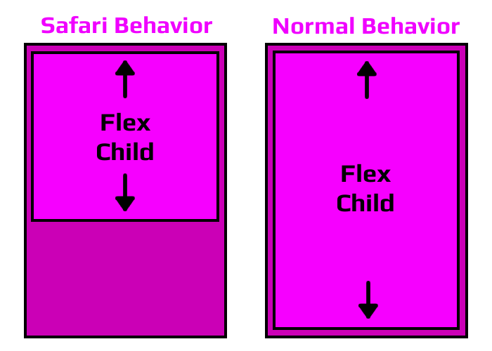
After coming up with the layout you see on the home page, I was feeling pretty good about the work I had done. When I jumped on my iPad to check how it looked on a smaller tablet screen, I noticed that the 4 smaller article div's were all different heights. I tried looking for a solution on a bunch of different forums and learned that there's a bug in the webkit implementation used in the latest Safari builds. This causes nested flexbox elements not to use 100% of the height of their parent elements. People had claimed that when tested with the development builds of the next version of Safari, the bug was fixed. I was a little disheartened, but figured I would just have to wait until Safari 11 was released.
The Solution
A couple days went by, but this bug wouldn't stop bugging me...is that why its called a bug? Anyway, I decided to dig further into it and see if there was any type of workaround short of abandoning flexbox altogether on Safari. I played with a bunch of different CSS configurations and came across a forum post where a guy said his flexbox child element wouldn't expand to full-height unless he removed the CSS rule, "height: 100%" from the child element. While this didn't work right away for me, it ended up being the key to solving this issue for Safari 10 browsers.
What I ended up doing was making sure that both the parent and child elements had the CSS rule, "display: flex". I then changed the child elements to use the rule "height: auto". Once this change was made, all Safari 10 browsers started displaying each flex row child elements at the same height. I made this CSS rule target only Safari browsers as this seemed to cause issues when applied to other browsers...looking at you Internet Explorer.
Hope this quick SrcBits tip helps you delve deeper into the world of flexbox. It's definitely worth exploring as you'll find it solves a lot of old CSS issues while simultaneously opening the door to a lot of new design concepts. If you're interested in me doing a writeup on how to target different browsers with CSS, comment down below.
 :
:  :
: